Showing posts with label process. Show all posts

Friday, January 16, 2015

Another New Year Begun!

Puppy Love
5x7" Watercolor on series 400 Strathmore Watercolor Paper
©BEDeuel Bronson Hill Arts 2015


I can't believe that it's been 5 weeks since my last post. I dislike letting the blog go unattended that long. It's a great to make contact with others & exercise the writing "muscle". It's also a fun way to not only debut new works but to share failures, solutions and successes.

Which is why I want to share my last commission of 2014. That was finished in 2015. Halfway through January, 2015. 

Yep. A harried end, and a slow start. But, it was a good start!


The customer requesting the pet portrait was preparing to give it as a gift for one of her customers. The original photograph that she gave me to use was a posed portrait. I started to work with it, but, was unsure as to why we would want a painted portrait of a photographic portrait. 
Formal Pose Attempt  #1

The colors and textures were stronger in the photo portrait but she had also texted a really sweet picture of the dogs that was truly perfect for a painting. 

So, the sketch was redone. We liked the more casual pose. 


Casual Pose Attempt #2

From there, my usual process went forward: sketch, scan, print on watercolor paper, paint. Photograph the process along the way to get a truer perspective of the image. And, that was crucial in this case.


Stepping back a moment to the printing on watercolor paper:  I'd been using a more basic watercolor paper for images that were really designed just for note cards. But, I had to be very careful to not overwork the paper, or it pilled too easily. This time I wanted to try to see if a better grade of paper would work to prevent that, especially since the final product was the painting, not a print. Sometimes the marketing is just that: marketing. But it did. I used a 400 series Strathmore watercolor paper vs. a basic Canson paper for watercolor. 

The first few steps went along fairly smoothly. Laid the darker color down, some highlights, and shading. From there, it was time to add the lighter colors and texture.


Dark Underlayment
Shading


Highlights


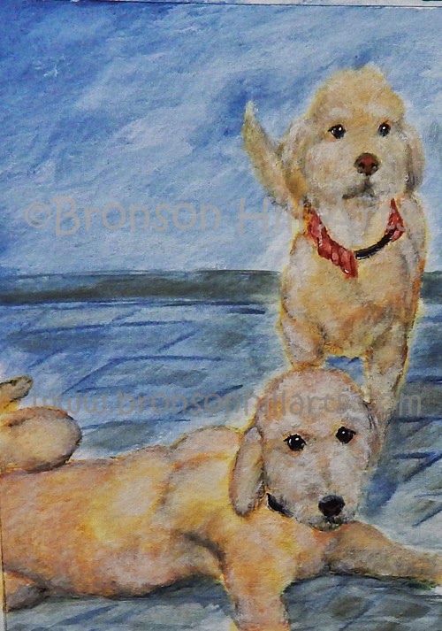
And, that's when I created ghost dogs. Yikes... This is, also, why I was very happy that I'd used a better paper! I did not want to start over again, since I was satisfied with everything else to that point. Plus, to compound the goof, for some reason, the images became flat.


Ghost Dogs


The camera showed all of that. It helped me to step back and "see" the problems more thoroughly, which in turn made the solutions easier to find.

It really was  simple: mix a light yellow/red brown, lay it down and go back with a more diluted white. The water  that diluted the white paint picked up enough of the brown to eliminate the ghost faces. I also purchased some fine line brushes which made it easier to create the texture around the mouth. My love of chiseled brushes had to be set aside. Then a straightforward "outline" solved the dimension problem. You can see it in the final image at the top & the bottom.


Flat Non-Ghost Dogs

Today, I hope to hear how the recipient likes the final painting. And, I hope she likes it as much as I liked making it. 

P.S.:  Thank you to my customer for her incredible patience! Next week, I'll touch on some of the changes in our systems that had to occur in order to not run into that severe a time-crunch again.


Final Product!


Friday, October 10, 2014

Building Rescue Love

A Tail to Tell!
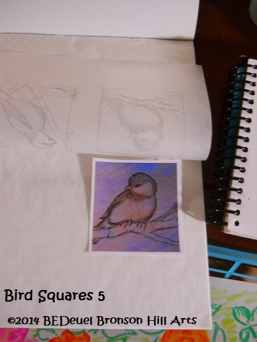
In talking about our respective causes & procedures with Stephanie, the author & proprietor of Crystal Allure Creations, the conversation turned to developing designs. Years ago, I'd designed a collection for her transplant awareness foundation, Lungs for Life, of butterflies. Flights of Life represent the gift of new breath with healthy lungs, post-transplant.  I ran her through the steps of how I do a watercolor note card design. It's similar to the process I showed a few months back in doing my Bird Squares.

It may seem like a lot of extra work, and, in a way, it is. But, what I find is that it makes me feel more secure in approaching an art piece.

One of the bad habits we have, as artists, is to overwork a piece . By taking a few extra steps, that tendency can be avoided.

Inspiration for the Painting: The Minions

Sketch for Minions & Squirrel
©Bronson Hill Arts 2014


I start with a basic sketch on regular sketch paper. It enables me to safely erase errors without real damage to the paper's texture. Once I have the lines & composition I want, I darken those details and lightly erase the superfluous marks.

Then I scan the picture into the computer. I can clean up any stray pencil marks and sometimes see what needs to be fine tuned on the following sketch.

Yes, the following sketch: I'll make a print onto heavier paper (such as watercolor paper) and adjust as many deficits as I can. At that point, I'll add the crosshatch/shading to the image. Then, you guessed it, scan it again.


Shaded Sketch for Minions & Squirrel
©Bronson Hill Arts 2014


Why? If I'm not satisfied with the second step, I can do it again! The same principle applies to the 3rd, , 4th, etc., steps!

Once I finish the sketch completely, I'll make a copy on higher quality watercolor paper. From there, I can paint away!

If I fumble, I can easily start again at any point I'd like. It takes a certain hesitancy out of the flow. I've used this method several times over & love the freedom it gives me to try. And try again, if necessary!

Making Progress on Minions & Squirrel


That being said, here is the final painting of the Kitty Kapers "Minions & Squirrel" card:

A very special "Thank you!" to Dina & her family for the great photograph &, mostly, the fantastic amount of love they put into raising these fur babies, the Minions, from the beginning!

The Minions & Squirrel
5x7 Watercolor on 140# Canson Paper
©BEDeuel Bronson Hill Arts 2014


All profits on the Note Card collections are given to the specified charity. In the case of Kitty Kapers, the proceeds will go to Another Chance Pet Rescue. 

Friday, April 11, 2014

Bird Squares Continued


Progress, so far:
Sketch on Paper Copy of Painted Background

Tracing the Sketch


Applying Charcoal to the Back of the Tracing


Transferred Sketches to the Canvases


The Painting!


One down; 3 to go!

Sunday, March 2, 2014

Bird Squares Part II

It's been a few weeks of typical day-to-day busyness. As such there has not been much in the way of art production of late.

But here are the next steps in developing the Bird Squares:

Each square was traced and "sized" for the canvas-


Next, charcoal was applied to the back of the tracing-


Lastly, the image is traced directly to the canvasses-


Simple as an elementary school exercise, but effective in order to comfortably design such a small composition!

With some luck, I hope to have the chance to take them to the next level some time this week!


*********************************************************************************

This past week, I was fortunate enough to be able to contribute to a new blog, Paper, Paint, Pencils & Pens, hosted by Lynn Cohen. Check it out some time; it's a very diverse, themed collection of artwork, across the boards! 

There are quite a  lot of fun challenges and showcases out in Blogger Land. And there is a lot of work that goes into so many of them. Thank you to all of our wonderful hosts!

Wednesday, February 19, 2014

Poppies A-Startin'


While the beginning process for this painting is not as involved as the process needed for the Bird Squares, I thought it would still be fun to document the start of Poppies!

This is being done on an 8x8" stretched canvas so laying down a charcoal sketch is much easier than on 3x3" squares.

The first image is the base: a mix of titanium white and sap green water soluble oils, blended and criss-crossed for texture. 


The second photograph is the laying-in of the basic reds and greens of the poppies, stems and leaves, over the charcoal sketch. You can still see some "extra" lines under the paint.


Will be jumping between the Bird Squares and Poppies, between everything else, of course! Stay tuned!


As Time Goes By... Woof!

As mentioned in the last blog,  it's been 8 years since we started to promote the idea of artistic personalized items. Bronson Hill Art...